
We look at some of the techniques for pulling together your kitchen’s scheme.
Contrast Cabinetry
Your kitchen doesn’t have to stay as one colour. By using two shades, not only does it give you opportunity to reference two colours from your palette, but it lets you change the pace of your scheme. One way to do this is by picking from the opposite sides of the colour wheel. Greenblue, Powder Blue and earthy red Paprika would be two examples, as would Flax Blue and Burnt Sienna or Mustard and Navy.
Another idea is to take one more colourful colour and one neutral. The contrast is still lively, but incorporating a more familiar shade like white or grey helps you to be braver with your cabinet accent colour. And then if all-over neutrals are more your cup of tea, you can do the same thing by choosing two colours from a core palette, Silver Birch and Grey Oak for instance, or Shell and Cobble.
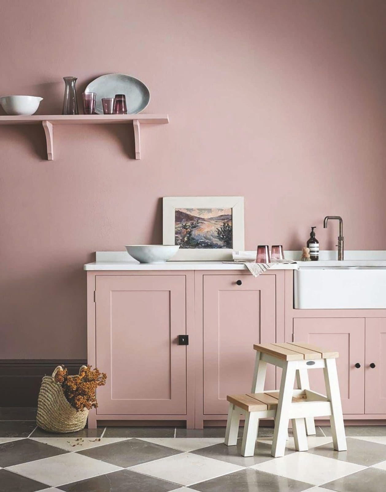
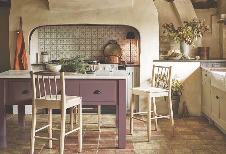
All-over Colour
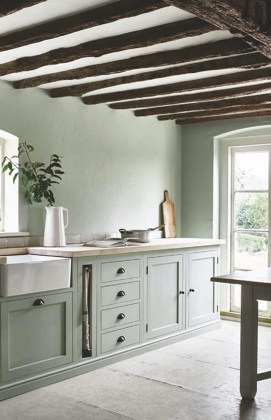
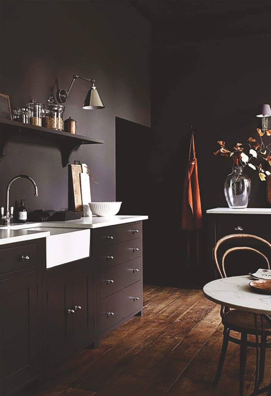
If two colours feel too much for your taste, paint all of your cabinets in the one shade. This is the more classic approach to painted kitchens.
What makes this effect more impactful, though, is when you carry that shade to other parts of the room. That could be by using the same colour on architectural woodwork like window frames, doors and skirting boards too, or it could be top to toe, with the walls and possibly even ceiling included. The latter sounds like a brave choice but, in actual fact, it can be very soothing, especially when done with calming colours like Sage, Walnut, Cactus or Old Rose.
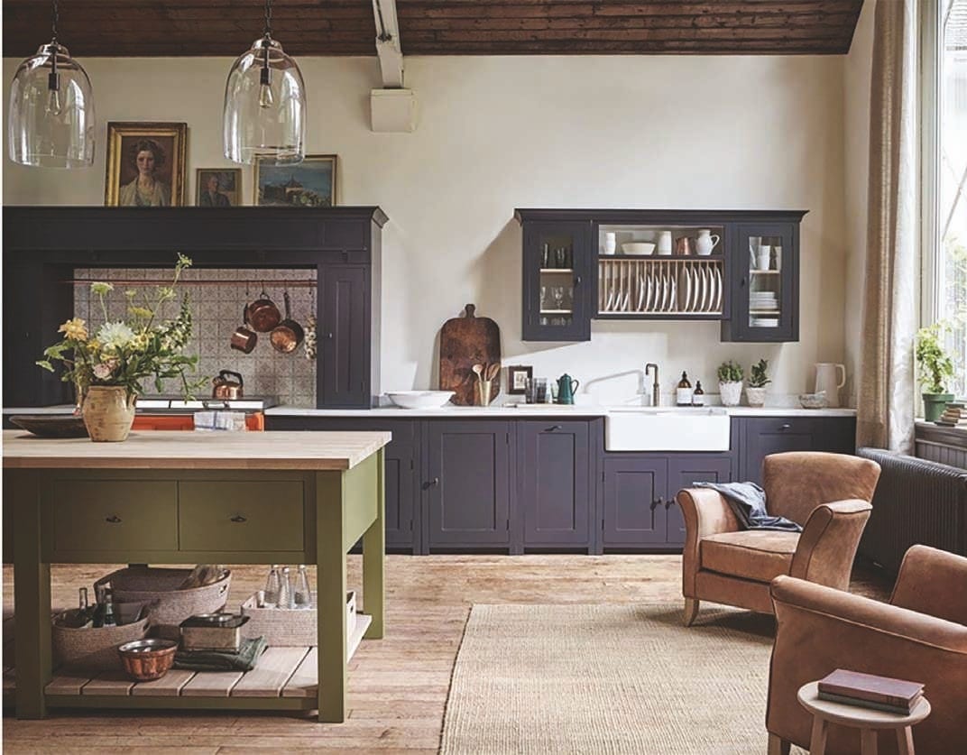
Beyond Cabinetry
Remember that paint isn’t the only way to apply colour in your kitchen. Wall and cabinet colours are the starting points, followed by your flooring, but the hardware, lighting, furniture and accessories – and any window treatments such as Roman blinds – you use are key to your palette so be sure to pick ones that are part of it, or at least a tonal extension of one of your key colours.
Appliances Count
An extension of thinking above and beyond cabinetry is considering whether your appliances can provide a flash of colour. You could choose a vibrant orange stove so that colour is felt in the kitchen, but in one bright burst rather than a long ribbon. If you then link it with other orange-based tones in the room, such as warm wood flooring and terracotta pots, it doesn’t feel remotely out of place.
Article courtesy of Neptune. For kitchen design advice, book a complimentary design consultation at your local Neptune store. (neptune.com)